

Data is useless without proper arrangement, visualization, and tools. When designing data-driven user interfaces, it’s critical for the final product to be easy to act and interact with, to scan and understand the connection with its parts. Every type of data can be hard to visualize, but large datasets in enterprise applications are especially complex to break down.
There are multiple proven ways of presenting large datasets, like tables, lists, graphs, or charts. But right now, let’s focus on the data that needs to be displayed in a highly detailed manner, with granular filtering and sorting capabilities. With these requirements, classic Data Tables and Data Lists come to mind.
Data Tables have been around for ages and we’ve come a long way since the first tables of data displayed on the plain text-only terminal interfaces. There are lots of design patterns and time-tested solutions for the data table layout and mechanics, but in this post, I want to highlight my experience and what I’ve learned by working with classic Data Tables vs Lists on touch native, small-screen devices.
Classic Data Tables
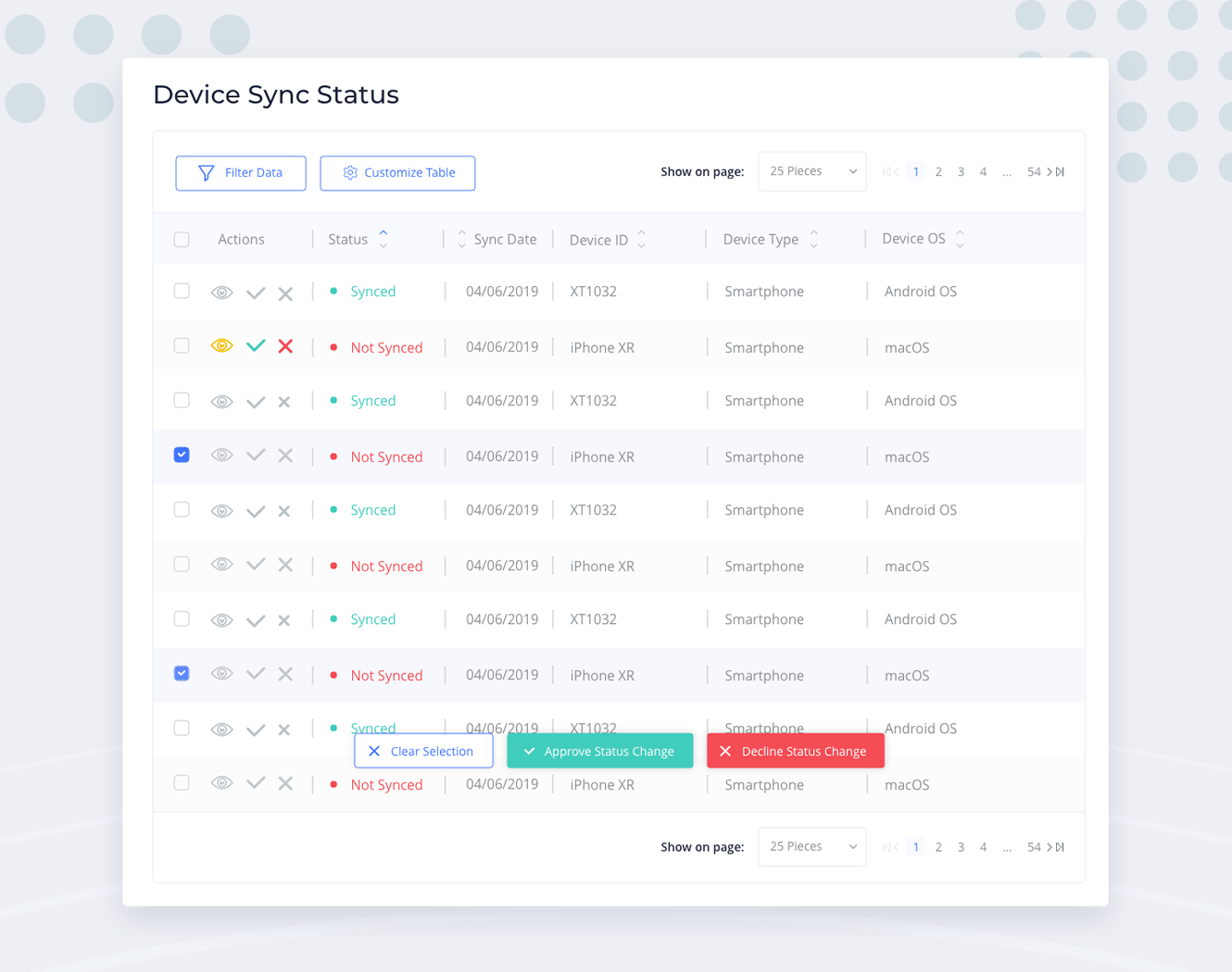
When there is a need of displaying lots of attributes for a large number of data points (for example, the list of machines with their technical properties, deployment status, ownership details, etc), the go-to solution is to display it with a Data Table. With this approach you can benefit from the maximum available screen space, it’s easy for grouping and organizing information, making it scannable, comparable, and digestible. Also, Data Tables are relatively easy to develop and tables, in general, are native for most of the users from real-life — tables are everywhere, from school grade sheets to medical test results and simplest Excel documents.

Tables make it easy to filter, sort, manipulate, and take actions on the data. Bulk actions are natural for data tables as well — like selecting multiple rows and performing actions on the selection with a single click.
At first glance, everything seems awesome, right? That’s mostly true, for devices with larger screens (desktops or laptops) this works really well, because:
- The widescreen size allows you to show a large amount of information in a single row and also, to show a lot of rows in a single screen. So users can scan and compare information efficiently.
- For interaction, we use a mouse. With this, we benefit from the precise mouse pointer, giving users the ability to interact with small objects, which makes it perfectly usable to have smaller, more tightly packed controls in the UI. Also, with the mouse, we have the “hover state”, that we can leverage for displaying contextual information or actions only when we need them.
Now enter the Touch Devices — tablets, phablets, smartphones, and other gadgets with a finger as a pointing device and no abundant screen real estate.
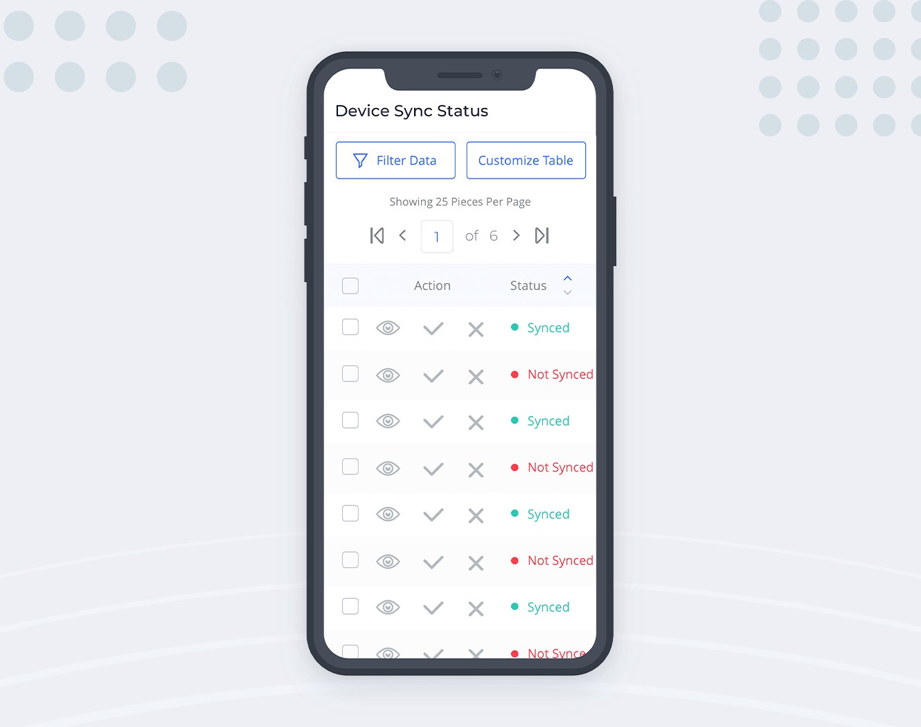
In this realm, small arrows which we were using for sorting become useless — tapping on tiny objects with our fat fingers is difficult and error-prone. This particular problem can be solved by making the sorting arrows a single control. Tapping the ‘merged’ button can cycle its state through sorting directions.
As for the table itself, the available screen width on smaller devices becomes the main villain. Keeping the table layout and making its container horizontally scrollable might be a viable option in some cases. But most of the time, the ‘scannability’ of each row is an important feature, which gets lost if you have to scroll horizontally just to see all columns of a single row.
Also, we have to figure out what to do with actions — usual suspects of the data table. We don’t want those buttons taking up precious horizontal space. Since in our use case mobile users will mostly visit the app for viewing the data, we can afford an extra tap for revealing the actions. So the action buttons can be collapsed into a single dotted control:
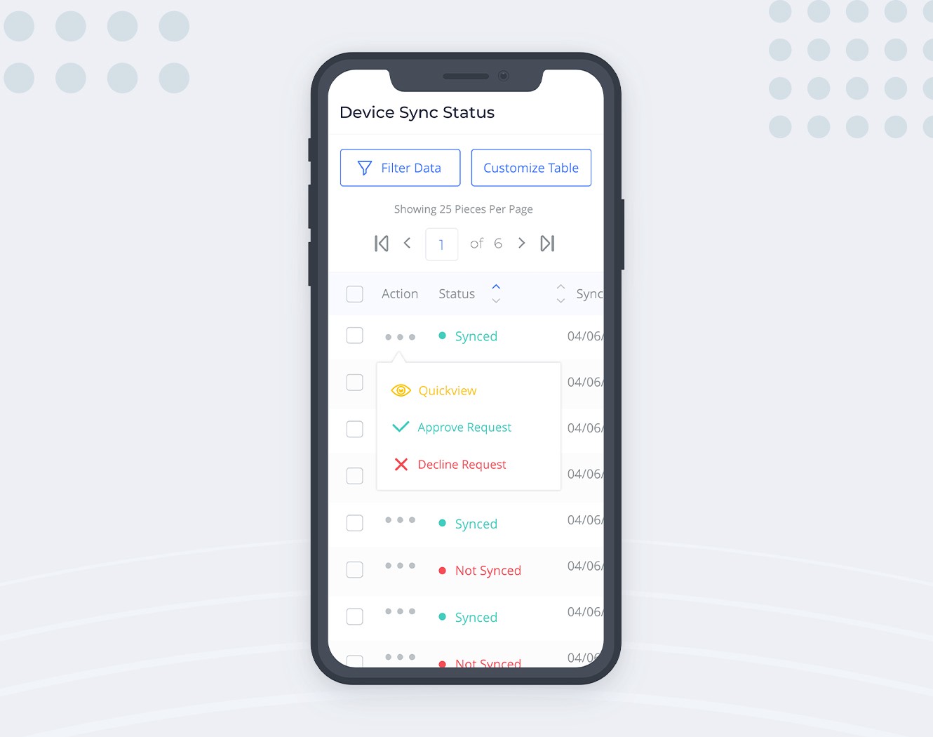
This also solves the issue of not having the hover state (and tooltips) on touch devices: we can put labels next to the action icons in this popout menu and keep things less ambiguous.
To sum up — pros of the data table:
- General simplicity of the concept;
- The native format for most of the users, familiar look and feel;
- Ease of presenting the structured data;
- Good for scanning the presented information;
- Simple for development, with lots of available tooling.
It’s clear that the pros above apply mostly to large screens. On the smaller devices, we have to compromise in one way or the other.
Lists
Mobile devices are everywhere and the mobile-first directions for the UI designs are becoming more common. If your users spend a significant amount of time using your product on the go, it makes sense not to compromise for smaller screens but to rethink how to transform the data table.
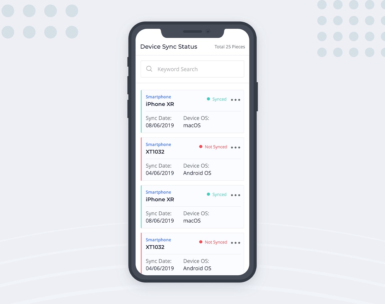
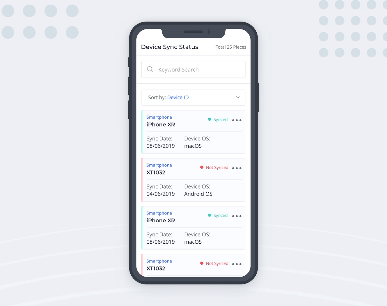
Lists are multiline, vertically aligned data containers. Since each container has no fixed height, data can flow naturally and take up as much space as needed, without clipping or hiding behind the horizontal scroll. Data in the list item container is scanned in a natural F-shaped pattern.
So each row of our data table becomes a single container on the narrow screen. If we properly arrange the data points in each container and represent the information structure with visual hierarchy, we’ll be able to avoid most of the shortcomings that the data table has with limited available width.
With lists, we’re sacrificing the beautiful feature of the table — having the columns. Finding a row by a single data point is super easy when scanning a single column for it. But if the list container has a consistent layout, almost the same ease-of-use can be achieved with lists as well. When the layout (and data) is not overly complex, users will quickly get a grasp on the data arrangement pattern and mentally apply it to all containers, all without even thinking about it.
We’re missing one thing here: we removed columns and sorting controls got lost as well. But since only a single column (data property) can be used for sorting at a time, we can turn this into the simple select box like this:
Conclusion
At the end of the day, every direction in UI comes down to the specific use case and to the expectations from the system.
You might have a dataset that has too few properties to cause problems in narrow-width data tables. Or your dataset might have lots of columns, making the list approach not feasible. So before jumping to a solution, think about the users and get as much information as possible on their usage situations — how will they use this interface, what are the most common goals and decide accordingly, trying to make life easier for most of your audience.